Mobile SEO Best Practices for 2025: The Complete Guide
This guide covers the stuff that actually matters in 2025. Responsive design calls you'll have to make, how mobile-first indexing really works under the hood, the UX signals Google's systems pay attention to, and a checklist you can run against your own site this week. No fluff.
Table of Contents
- What Is Mobile SEO and Why Does It Matter in 2025?
- How Does Mobile-First Indexing Work?
- Responsive Design: The Foundation of Mobile SEO Best Practices
- What Mobile UX Factors Influence Search Performance?
- Page Speed and Core Web Vitals on Mobile
- Common Mobile SEO Mistakes to Avoid
- How Much Does Mobile SEO Optimization Cost?
- A Practical Mobile SEO Checklist for 2025
What Is Mobile SEO and Why Does It Matter in 2025?
Mobile SEO is the practice of optimizing your site so pages load fast, display correctly, and are actually usable on phones and tablets, because Google primarily crawls and ranks the mobile version of your pages. Put simply: the mobile experience of your site, not the desktop one, is what decides whether you show up in Google for the overwhelming majority of searches.
And this matters way more in 2025 than it used to, because Google's crawling and ranking systems now default to the mobile rendering of your pages. So if you've got content, links, or structured data that only lives on the desktop template and quietly vanishes on mobile? Google might never see it. That one gap, content that "disappears" on phones, is one of the sneakiest reasons a site that looks technically solid still tanks in organic search.
There's a user side to this too. A site that's slow, cramped, or annoying to tap doesn't just rank worse. It converts worse. People who can't read your menu, wrestle with a form, or hunt down your phone number on a tiny screen just... bounce. And that behavior piles up against you no matter how the page happens to rank.
How Does Mobile-First Indexing Work?
Mobile-first indexing is the system Google uses to crawl, render, and index the mobile version of a page first, then use that mobile version to determine rankings across every device. Per Google Search Central's own docs, this has been the default for newly created sites since July 1, 2019, and Google spent the years after that dragging existing sites over to the same system.
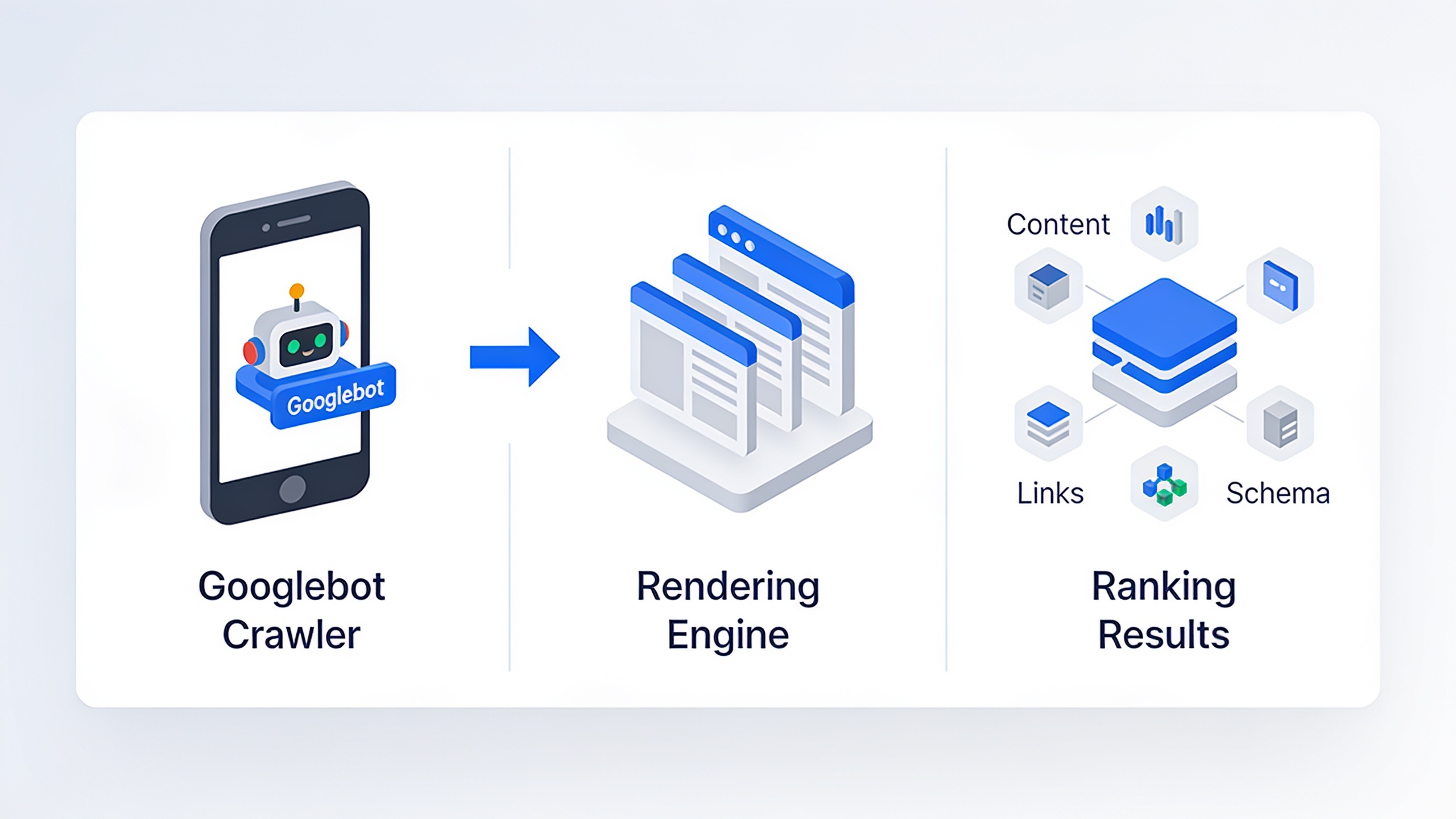
What this means in practice is pretty simple. When Googlebot shows up at your site, it's usually arriving as a mobile crawler (identifying itself with a smartphone user-agent), rendering the page like a phone would, and building its understanding of your content, links, and schema off that version. So say your desktop site has this gorgeous mega-menu, a footer stuffed with useful links, and long, detailed product descriptions. But your mobile template strips all that out to save room. Guess what Google indexes? The stripped-down version. Not the good one.
A few things fall out of that reality. Parity matters more than polish, meaning your mobile and desktop pages don't have to look identical, but the core content, headings, and internal links need to be equivalent. Structured data has to exist on mobile too, because schema you only added to the desktop template (Article, Product, FAQ, whatever) is basically invisible to a mobile-first crawler. And if your images or content sections only load when someone taps or scrolls in a way that blocks rendering, they might not get indexed at all.
If you're generating content at scale or programmatically, pay extra attention here, because templating mistakes love to replicate themselves across every single page. Teams running AI-assisted publishing workflows, including tools like RobinRank that write and push articles straight into a CMS, should double-check that the mobile rendering of those automated posts actually matches what they meant to publish. Especially the schema, the internal links, and image alt text, since all of that gets generated as part of the publishing step.
Responsive Design: The Foundation of Mobile SEO Best Practices
Responsive design is a development approach where a single HTML page automatically adjusts its layout, images, and navigation to fit whatever screen's looking at it, using CSS media queries instead of separate code for different devices. Google's been recommending this setup for over a decade, and honestly it's still the least painful way to satisfy mobile-first indexing. One URL, one set of content, done.
It's not the only option out there. But the alternatives come with more maintenance headaches and a lot more room to shoot yourself in the foot.
| Configuration | How It Works | SEO Implication |
|---|---|---|
| Responsive design | One URL, one HTML source, layout adapts via CSS | Easiest to keep content and schema in sync; Google's preferred setup |
| Dynamic serving | Same URL, different HTML/CSS served based on user-agent detection | Requires correct `Vary: User-Agent` HTTP header; misconfiguration can cause cloaking issues |
| Separate mobile URLs (e.g., m.example.com) | Distinct URLs for mobile and desktop versions | Requires bidirectional annotations (rel=canonical and rel=alternate); higher risk of duplicate content or broken redirects |
For most businesses, especially small teams without a dedicated front-end dev, responsive is just the sane choice. You're not maintaining two templates and two sets of metadata that inevitably drift apart. Separate mobile URLs and dynamic serving are mostly legacy patterns at this point, and Google's guidance has been nudging people toward a single responsive template for years precisely because it kills off so many opportunities to misconfigure things.
A handful of responsive details that directly move the needle on mobile SEO:
- The viewport meta tag. Every page needs `` so the browser renders at the device's real width instead of pretending it's a desktop.
- Tap target sizing. Buttons and links should be big enough, and spaced enough, that an actual human finger can hit them. Cramped tap targets are a complaint that shows up in mobile audits constantly.
- No horizontal scrolling. If your content overflows and forces people to swipe sideways, that's a dead giveaway of a badly adapted layout.
And here's the one people forget: consistent content, not just consistent design. Your headings, body copy, and internal links all need to carry over to mobile in full, even if you've reorganized them into accordions or tabs.
What Mobile UX Factors Influence Search Performance?
The mobile UX factors that influence search performance include page speed, layout stability, tap target sizing, intrusive interstitials, and how easily someone can actually finish what they came to do on a small screen. Google's been pretty upfront that page experience signals, evaluated mostly on mobile, feed into whether a page deserves to rank, especially when two competing pages are otherwise a coin flip on relevance.
Interstitials and Pop-Ups
Google specifically calls out intrusive interstitials, those full-screen pop-ups that slam over the main content the second you arrive from a search result, as a lousy mobile experience. Newsletter modals, app-install banners, cookie notices that eat the whole screen with no obvious way to dismiss them. All of it. The stuff that's legally required (cookie consent) or small banners taking up a reasonable slice of the screen get treated more gently than full-on screen takeovers.
Legibility Without the Pinch-and-Zoom Dance
Text that's too small to read without zooming, or buttons crammed so close you can't tap the right one, forces people to fight the interface instead of just reading. This is one of the most common flags in Google's Lighthouse and PageSpeed Insights mobile audits, under checks like "Document doesn't use legible font sizes" and "Tap targets are not sized appropriately." If you've never seen those warnings, run the tool. You probably have a few.
Navigation Built for Thumbs, Not Cursors
Desktop navigation just doesn't survive the jump to touchscreens. Wide mega-menus, hover-triggered dropdowns, none of it works when there's no cursor to hover with. Mobile-friendly navigation usually means a hamburger menu, a sticky bottom nav for the important actions, or collapsible accordions that keep the page scannable without making people scroll forever to find a link.
Layout Stability
You know that thing where you go to tap a button and the page shifts underneath you at the last second so you hit an ad instead? Infuriating. That happens when ads, images, or fonts load asynchronously without space reserved for them. Google measures it directly with Cumulative Layout Shift (CLS), which we'll get into below.
Page Speed and Core Web Vitals on Mobile
Page speed on mobile gets measured through Google's Core Web Vitals, three metrics (Largest Contentful Paint, Interaction to Next Paint, and Cumulative Layout Shift) that quantify loading speed, responsiveness, and visual stability as experienced mostly on real phones. Google's PageSpeed Insights and Search Console report these using mobile data by default for most sites, which tells you everything about where their priorities are.
Quick breakdown of what each one's actually catching.
Largest Contentful Paint (LCP) measures how long it takes for the biggest visible element, usually a hero image or a headline, to fully render. Here's why mobile makes this brutal: phone connections and mid-range devices are slower than desktops, so an image that snaps into place instantly on your fancy dev laptop can lag hard on someone's phone over a spotty mobile network.
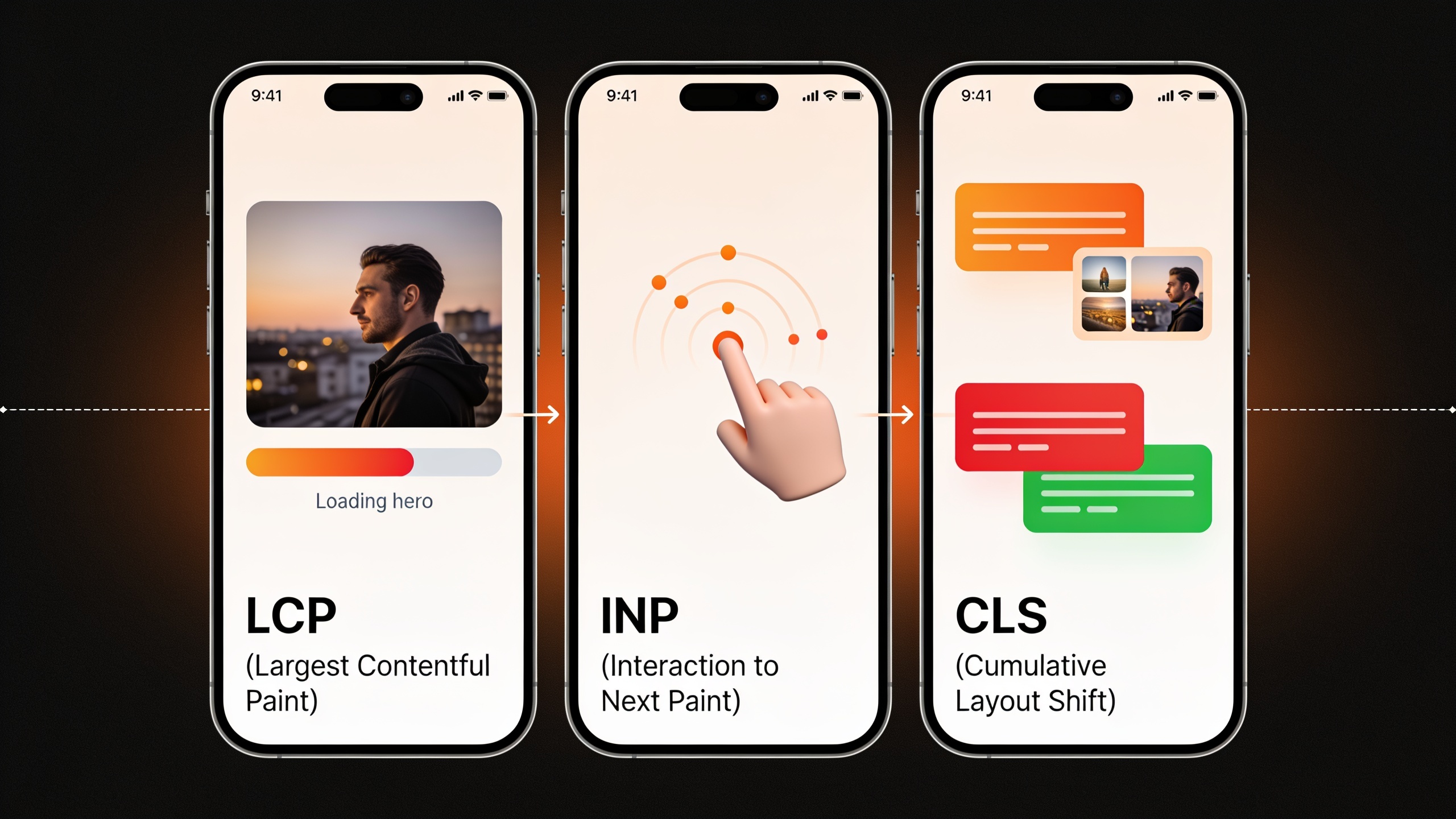
Interaction to Next Paint (INP) measures how fast the page reacts after someone taps, scrolls, or otherwise pokes at it. This one replaced First Input Delay (FID) as an official Core Web Vital in March 2024, according to Google's Chrome team, specifically because it captures responsiveness across a whole session instead of just the first interaction. Which is a smarter way to measure it, honestly.
Want content like this running on autopilot for your own site? Try RobinRank free — AI-written, SEO-optimized articles generated and published automatically, no credit card required.
Cumulative Layout Shift (CLS) measures unexpected movement of stuff on the page as it loads. This one's especially nasty on mobile, where a shift of even a few pixels can yank a button right out from under someone's thumb.
The fixes that reliably move these numbers on mobile? Compress and properly size your images (serve a phone-sized file, not a desktop-sized one). Set explicit width and height attributes on images and embeds so the browser can reserve space before the asset shows up. Defer non-critical JavaScript. And rein in third-party scripts, ad tags and chat widgets and the like, which have a way of hogging your entire mobile load time.
If you're weighing whether to invest in dedicated technical SEO tooling, an AI writing platform, or a whole content operation, it helps to see where the wider category is headed. The State of AI SEO Software: 2025 Industry Report digs into where automation's going and which capabilities are becoming table stakes, which is genuinely useful context when you're trying to figure out how much of your mobile SEO workflow to automate versus just do by hand.
Common Mobile SEO Mistakes to Avoid
The most common mobile SEO mistakes all boil down to the same thing: content or functionality that exists on desktop but gets degraded, hidden, or straight-up broken on mobile. And because of mobile-first indexing, those gaps are exactly what Google sees. Here are the ones that turn up in audits over and over.
| Mistake | Why It Hurts Rankings | How to Fix It |
|---|---|---|
| Hiding content behind "read more" toggles that don't load on crawl | Content Google can't render may not be indexed or may be weighted differently | Ensure hidden/expandable content is present in the HTML and loads without requiring a click that blocks crawlers |
| Blocking CSS/JS files via robots.txt | Googlebot can't render the page accurately, leading to misjudged layout or missing content | Audit robots.txt and remove blocks on resources needed for rendering |
| Full-screen pop-ups on page load | Flagged as an intrusive interstitial that degrades page experience | Use smaller banners or delay pop-ups until after meaningful engagement |
| Unplayable or unsupported video/Flash elements | Content becomes inaccessible on mobile browsers entirely | Use standard HTML5 video with proper fallback text and captions |
| Slow mobile load from unoptimized images | Directly lowers LCP scores and increases bounce rates | Compress images, use responsive `srcset` attributes, adopt modern formats like WebP or AVIF |
| Desktop-only structured data | Mobile-first indexing means schema not present on mobile isn't seen | Add schema markup to the mobile-rendered HTML, not just desktop templates |
| Tiny or crowded tap targets | Causes mis-taps and frustration, contributing to poor engagement signals | Increase spacing and sizing per accessibility and mobile usability guidelines |
Checking for this stuff is part of any decent technical SEO review. But you really want to re-check after a redesign, a CMS migration, or when you start using automated publishing tools, because a template change can quietly reintroduce mobile-specific bugs across hundreds of pages before anyone notices.
How Much Does Mobile SEO Optimization Cost?
The honest answer: it varies wildly, and anyone quoting you one fixed price is guessing. It depends on whether you're patching up an existing responsive site, rebuilding a legacy desktop-only dinosaur, or scaling ongoing content production. It depends on the size of your site, how bad the technical problems are, and how much you're doing in-house versus paying someone else. A small business fixing viewport and image issues across a dozen pages is in a completely different universe than an enterprise migrating thousands of URLs off a separate mobile subdomain.
Where the money tends to pool, roughly:
- One-time technical fixes (viewport tags, image compression, killing render-blocking resources) are usually the cheapest, since once they're done right, they stay done.
- Structural changes like moving off separate mobile URLs or dynamic serving onto a single responsive template cost more upfront but slash your long-term maintenance.
- Ongoing content and monitoring is where the recurring spend lives. Auditing new pages for mobile usability, keeping Core Web Vitals healthy as you scale, maintaining schema across templates. And this is the part most affected by whether you're using in-house staff, an agency, or AI tools.
Since so much of modern mobile SEO overlaps with your broader content operation anyway (publishing consistently, keeping metadata and schema correct at scale, watching your technical health), it's worth knowing the going rates across content marketing generally. How Much Does AI Content Marketing Cost in 2025? breaks down pricing across in-house teams, agencies, and AI-driven platforms, which helps you figure out whether a one-off manual fix or an automated, ongoing workflow makes more sense for your budget.
A Practical Mobile SEO Checklist for 2025
A good mobile SEO checklist confirms three things: your site is technically crawlable on mobile, it's usable by real people on small screens, and it's fast enough to keep both visitors and Google happy. Run through this before you assume your mobile experience is fine.
Technical foundation
- Confirm the site uses responsive design with a properly configured viewport meta tag.
- Verify robots.txt isn't blocking CSS, JavaScript, or image resources needed for rendering.
- Check that structured data (schema markup) appears in the mobile-rendered HTML, not only the desktop template.
- Use Google Search Console's URL Inspection tool to confirm pages are indexed via the mobile version and render as expected.
Speed and stability
- Test Core Web Vitals (LCP, INP, CLS) using PageSpeed Insights or the Chrome User Experience Report data in Search Console, using mobile results specifically.
- Compress and properly size images; adopt modern formats like WebP where supported.
- Reserve space for images, embeds, and ads to prevent layout shift.
- Minimize or defer third-party scripts that aren't essential to the initial page load.
Usability
- Remove or shrink any full-screen interstitials that appear immediately on page load.
- Verify tap targets (buttons, links, form fields) are large enough and adequately spaced.
- Confirm text is legible without requiring the user to zoom.
- Test primary user journeys (checkout, contact forms, sign-ups) end to end on an actual phone, not just a browser's device emulator.
Content parity
- Confirm all content visible on desktop (including internal links and expandable sections) is present in the mobile HTML.
- Re-audit templates after any redesign, CMS migration, or bulk-publishing rollout for mobile-specific regressions.
Run this quarterly, and immediately after any big site or template change, and you'll catch most mobile SEO regressions before they do real damage to your rankings.
Frequently Asked Questions
Is mobile-first indexing the same thing as having a mobile-friendly website?
Nope. Mobile-first indexing describes how Google crawls and indexes your site (using the mobile version as the main basis for ranking), while mobile-friendliness is about whether that mobile version is actually pleasant to use. A site can be fully included in mobile-first indexing and still have a miserable mobile experience. The indexing method doesn't guarantee good UX. It just decides which version of the page Google is grading.
Does a separate mobile site (m.example.com) hurt my SEO?
Not automatically. But it opens up a lot more room to mess things up, because Google needs correctly configured bidirectional annotations (rel=canonical pointing to the mobile page, rel=alternate pointing back to desktop) to understand how the two versions relate. Responsive design sidesteps the whole mess by using one URL and one template. That's why I'd steer almost anyone toward responsive unless you've got a very specific reason not to.
How often should I test my site's mobile performance?
At minimum, after every redesign, template change, CMS migration, or major content push, since those are exactly the moments that tend to break mobile stuff. Past that, keep half an eye on Core Web Vitals in Google Search Console, which reflects real user data over rolling 28-day periods, so you can watch how your mobile performance trends over time instead of just snapshotting it once.
Do AI-generated or AI-published articles need special mobile SEO treatment?
Same treatment as any other page, really. Content parity between mobile and desktop, schema that renders correctly, clean HTML that doesn't block rendering. Platforms that automate publishing, like RobinRank, generate the SEO elements (titles, meta descriptions, JSON-LD schema) as part of the workflow, but I'd still spot-check how those automated posts look on an actual phone. Especially right after you connect a new CMS or swap a template, since that's when things quietly break.
What's the single highest-impact mobile SEO fix for a small business site?
For most small business sites, it's page speed. Specifically image optimization and stripping out unnecessary third-party scripts. Slow mobile load times hit you twice: they drag down your Core Web Vitals scores and they drive people off the page before it even finishes loading. And the best part is you don't need a redesign to fix it. It's mostly just cleaning up assets and scripts you already have.
Look, mobile SEO in 2025 isn't some separate discipline sitting off to the side. It's just where SEO happens now, because Google's systems are built around the mobile version of your pages by default. Nail the fundamentals (a genuinely responsive layout, content parity between mobile and desktop, solid Core Web Vitals, and a usability check that thinks in thumbs instead of cursors) and you've covered the vast majority of what determines mobile search performance. After that it's maintenance. Re-check your templates when things change, keep an eye on your Core Web Vitals trends, and make sure whatever publishing pipeline you're leaning on renders cleanly on the small screen where most of your audience is actually going to meet you.
Ready to stop writing content by hand? Start your free RobinRank trial and get a full month of SEO-optimized articles published on autopilot.